Social Media Graphics: 5 Simple Tips for the Non-Designer
- Keep Your Brand in Mind Always

- Image Post: 1200 x 630 px
- Event Cover Photo: 1920 x 1080 px
- Image Post: 1080 x 1080 px
- Story Post: 1080 x 1290 px
- Image Post: 1200 x 627 px

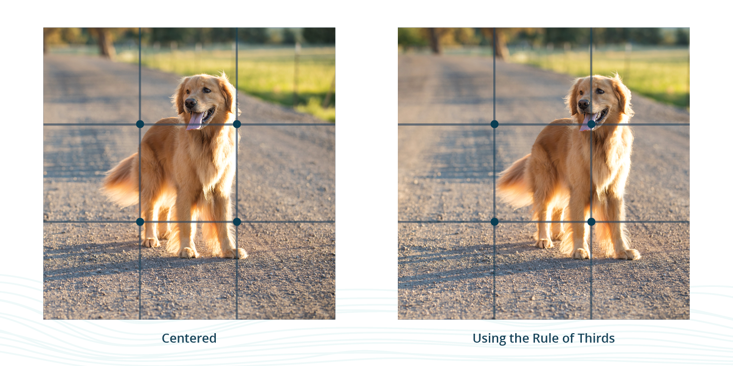
The rule of thirds is a type of composition in which an image is divided evenly into thirds, both horizontally and vertically, and the subject of the image is placed at the intersection of those dividing lines, or along one of the lines itself.

You can also use an image as a background. If you choose to do this make sure that the image isn’t too busy where it takes away from the text of the graphic. You want to find an image that works more as a background element and not as the main focus. To help keep the text the main focus and I suggest you add a layer on top of the photo. This can be just adding a colored layer and dropping the opacity enough where you can still make out the image but aren’t distracted by it. The graphic below is a great example of how to do this. The photo isn’t taking away from the main focus of the graphic because it is muted in the background.

Author Info
Hi there! My name is Sidney Meyers and I am one of the Graphic Designers here at Systemax. I am responsible for creating artwork, anywhere from logos to social media graphics, to fulfill the needs and goals of a variety of different clients. Outside of work, you can most likely find me hanging out with friends, planning my next weekend adventure, or creating projects on my Cricut!


