Graphic Design Trends: 5 Simple Ways to Keep Your Graphics Fresh in 2022


Wondering how to upgrade your graphics to stay on-trend as you leap into the new year? These simple graphic design trends will keep your marketing fresh and captivate your audience. No need to be a trained graphic designer; these 5 trends can be used as inspiration to anybody. 
 
Try using these graphic design trends alone or combining more than one of these techniques to your next visual.
  • Fun Data Visualizations
  • Bold Backgrounds
  • Colorful Icons
  • Serif Fonts
  • Branded Memes


Fun Data Visualizations
 
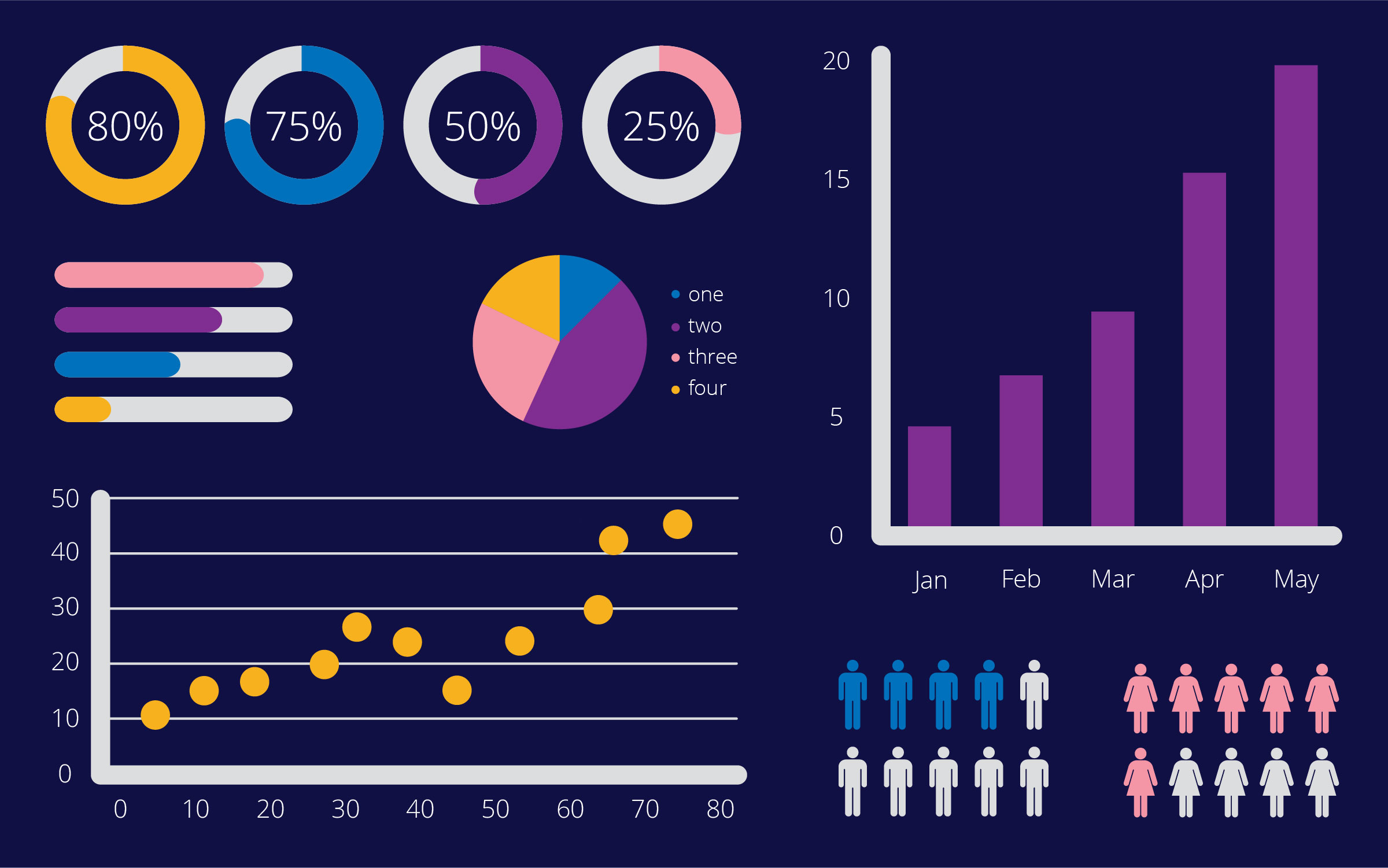
Starting with my personal favorite of the graphic design trends: data visualizations. A data visualization is the process of translating large data sets and metrics into charts, graphs, and other visuals. 
 
Data visualizations give you the ability to highlight the most important findings and translate complex data into simple messages. This makes the data more easily consumable for your target audience. They can be as small as presenting a percentage or as large as displaying a full chart. 


Infographics-Graphic-Design

Find out more about the types of data visualizations here.
 
In the past couple of years, we have been presented with several forms of data from the medical field regarding the COVID-19 pandemic. Consumers are undoubtedly much more comfortable with reading data now that is presented to them because of this.
 
Because of this increased comfort with reading charts and graphs, data visualizations have grown in popularity and are now one of the top graphic design trends that you will be seeing more of in 2022. So this is a perfect opportunity for you to start using data visualizations and infographics in your marketing materials.
 
You can easily make data visualizations more fun by integrating the other graphic design trends I mention below, such as adding color to catch the eye or including icons to make the data even easier to consume….if it could get any easier. 
 
Like most trends, being simple can go a long way. With data visualizations, you don’t want to go overboard with too much data or detail to confuse the consumer. You want it to be simple and concise with just the right amount of relevant content so that obtaining the key takeaways from the data is as simple as looking at a photo.


Just remember the old saying: K-I-S-S. “Keep it simple, stupid.”
Bold Backgrounds
 
As mentioned before, bold backgrounds can go hand in hand with data visualizations, but you can also incorporate bold backgrounds into any graphic to capture the audience’s attention. 
 
Bold backgrounds are often vibrant, bright, solid colors that provide an easy contrast with the main content of your graphic, but they can also separate your graphic from other content on a social media feed. 
 

Spotify-Bold-Background  Source: https://twitter.com/Spotify

 
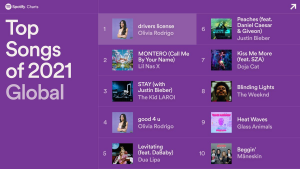
Spotify shows a great, successful way of using bold backgrounds. They immediately grab your attention while scrolling on a social media feed, but also don’t take away from the content that’s being presented on the graphic. 
 
It’s important to keep in mind when using bold backgrounds that your text doesn’t get lost and that the color isn’t too overpowering. Make sure you find a good balance with the color of the text and even the weight or thickness of the other elements included in the graphic. 
 
 
Colorful Icons 
 
An icon ~in my own words~ is a small graphical representation of something. They provide a simple way to get a message across quickly and easily.
 
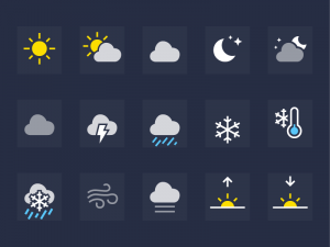
You may see icons every day without even noticing what you’re viewing. For example, the following icons are probably displayed on your phone every morning without any words to provide you with enough information on how to dress.


Spotify shows a great, successful way of using bold backgrounds. They immediately grab your attention while scrolling on a social media feed, but also don’t take away from the content that’s being presented on the graphic.

 
It’s important to keep in mind when using bold backgrounds that your text doesn’t get lost and that the color isn’t too overpowering. Make sure you find a good balance with the color of the text and even the weight or thickness of the other elements included in the graphic.
 
When you think of the word “hot,” it’s likely that an image of a flame appears in your head. This flame is considered an icon. It’s an image that goes with the thought or an already existing communication, providing a quick and simple way to share messages at a glance. This makes icons a very powerful marketing tool.
 
Essentially you are replacing a word or phrase with a graphic image that shows the meaning of that word. For example, if I was talking about different types of food in a graphic, instead of listing the names of foods, I could instead present icons of the foods I was talking about.
 
 
Food-Icons
 
Plot twist…icons also go with bold backgrounds and colors! You can use the colors to create a contrast to make the icon pop on an image or even on a feed alone.
Serif Fonts 
 
In the past year, serif fonts have grown in popularity and they’re here to stay.
 
Now, what even is a serif font? Serif fonts are typefaces that have serifs, which are extra strokes on the ends of their letterforms. 
 

Source: https://www.impactplus.com/blog/sans-serif-vs-serif-font-which-should-you-use-when
 
Though they may seem outdated, you can use a stylish version of the classical style to fit with today’s modern aesthetic.
 
Serif fonts have a better chance of standing out on graphics because brands commonly use a san serif font – wait, what’s a san-serif?! It’s a font that does not have those little decorative strokes on the ends of their letterforms.


Now, back to it, serif fonts are known to come off as dependable, elegant, calming, and trustworthy. Using this type of typeface in your marketing materials or branding can easily portray these feelings or tones to consumers or other businesses.
Branded Memes
 
Memes are often amusing or interesting images that include text and are copied with slight variations to carry symbolic meaning. They’re often spread widely online, especially through social media, becoming somewhat of a cultural phenomenon that is widely understood.
 
For example, the success kid meme is often associated with victories, even if that victory just means receiving an extra chicken nugget.


A branded meme is exactly what a meme is but adding your own little twist to it to make it specifically unique to your brand.


This is a great way to promote your brand without coming across as too serious. Since memes are so well known and share a message without context, using them can help your audience consume your content easier. Branded memes can be a fun way to communicate through humor and be more personable with your audience. It’s an excellent resource to capture the attention of younger audiences and stay relevant in the marketing world of 2022. 


Here are the 5 key takeaways:  
  • Data visualizations: Easy and fun way to present data to your audience
  • Bold Backgrounds: Good way to catch the eye on a busy feed
  • Colorful Icons: Mindless way to share a message without as many words
  • Serif Fonts: Use this font style to come off as dependable and calming
  • Branded Memes: Use these to share a message but in a fun, humorous way

I hope these 5 simple graphic design trends will help you keep your graphics fresh in 2022 and in years to come!

Watch the condensed version of the blog on the Systemax Marketing Show here:


Author Info

Hi there! My name is Sidney Meyers and I am one of the Graphic Designers here at Systemax. I am responsible for creating artwork, anywhere from logos to social media graphics, to fulfill the needs and goals for a variety of different clients. Outside of work, you can most likely find me hanging out with friends, planning my next weekend adventure, or creating projects on my Cricut!