Social Media Graphics: 4 Things to Keep in Mind When Designing for Social
From video reels to page after page of posts, we consume a lot of information through social media. Just take a look around. I bet you can’t go longer than 5 minutes without finding someone scrolling through the news or catching up on the latest TikTok trend. According to an article published by Forbes, a study by Uswitch found that in 2020 the average American spent more than 1,300 hours on social media platforms. That is a staggering number! And it proves why it is so important that businesses make social media a vital part of their marketing. Your brand needs to be out in front of all those people. And, of course, it should look its absolute best. So, here are four things to keep in mind when it comes to designing for social.
1. Understand the Platform
In today’s world, there are more than a handful of social media platforms out there and they are not all the same. The features and graphic options available to you on one site can differ from those on another so it’s important to take the time to get to know each platform. Make a list of all the areas that require or could potentially utilize a graphic.
Ask yourself:
- Does the site allow my business to have its own page? If so, will it need a profile picture or cover photo?
- What are my options when it comes to posts? Can I add images? Videos?
- What are my ad options and can my design skills be utilized there?
Take the time to figure out what options are available to you and the specs and requirements required for each.
Also, it is important to check regularly for updates. Often, these sites will make changes with no warning to their users. For example, if Facebook were to change up the size and placement of their cover photos, it could potentially throw off your entire design. Parts of the cover photo could be covered up by the profile picture, or it will display correctly on mobile, but not on desktop, or vice versa.
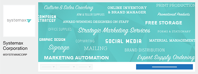
2016 Facebook Profile Picture and Cover Photo Layout
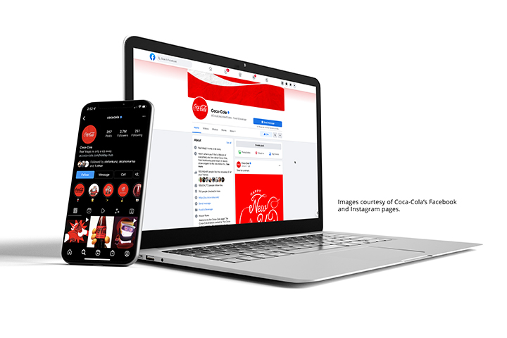
2022 Facebook Profile Picture and Cover Photo Layout
Another thing to look for is changes in rules and guidelines, especially for things like ads. A good example of this was Facebook’s 20% text rule. Prior to 2020, Facebook required that all ad images be covered by 20% or less text. Any more and its algorithm would reduce your ad reach. They later removed this requirement, freeing designers from the constant worry of that last word sending them over the edge.
The world of social is constantly changing. Make it a habit to do your research every now and then. Look up social trends and updates, especially on the platforms that you know you’ll be using the most.
2. Know Your Target Audience
Before you design anything, take some time to understand the people who will be consuming your content.
What is a target audience?
It is a group of people who have shared attributes and values. They are a group most likely to take an interest in a specific product or service. To learn more about target audiences, click here (link to KNS blog).
By knowing and understanding your target audience, you can then begin to tailor your designs to those people. You want your graphics to resonate with them and build a connection that will not only bring them back to your page but also drive them to your website and on to other initiatives within your marketing plan.
3. Don’t Forget to Stay on Brand
Social media should be an extension of your brand. It should have the same look and feel like any other marketing piece that you put out into the world. When a person goes to your social page, they should be able to immediately recognize who you are, whether it be by the images that you use or simply the colors.
And this shouldn’t only be limited to your profile picture and cover photo. Bring some of your branding into the designs you create for your posts. Overlay brand colors. Use your company fonts. Bring in on-brand graphic elements. Just make sure that the designs are authentic to you while still staying relevant to your audience.
4. Keep it Simple
As designers, there is so much we want to get across to our audiences. It could be a message, a feeling, or a call to action. Sometimes there can be so much that we want to include that we want to just throw everything into the design so it’s all there. But, we need to take a step back and remember where these designs are going. With social media, people are scrolling so fast through their feeds that your graphics only have a couple of seconds to grab their attention, so keep things simple.
As you design, ask yourself:
- Do things seem busy, crowded, or overwhelming in any way?
- If I were to put myself in my target audience’s shoes, would it catch and hold my attention, or would I scroll on by?
- Is there too much text? (Keep in mind that some of your graphics will likely go hand-in-hand with some sort of post or ad copy. You don’t need to overwhelm your designs with text as a lot of the details will likely be within the copy or linked to an external page.)
While a simple design may seem underwhelming on its own, it’s important to look at the big picture. That one graphic is a small part of a bigger strategy. Combined with additional posts and ads, you’re working to not only enhance your brand’s presence on social but toward your overall marketing goals.
Want more social design tips? Check this out blog for more!
Author Info
Hello! My name is Kaitlyn and I am one of the Graphic Designers here at Systemax. Every day, I work hand in hand with our team to develop designs that not only look great, but meet our client’s needs and help push them toward their goals. Outside of work, you can find me with my family and friends, scrolling the web for new design tricks and inspiration, or messing around with my camera.


